
For technology investors who want to understand what’s actually driving the market…
The Force Behind Every Major Move in Technology Markets Since 2018
Most investors are watching the wrong thing — and the chart below shows what they’re missing
Most investors are watching the wrong thing
I don’t say that to be harsh.
I say it because I spent years doing exactly the same thing.
Watching interest rate decisions. Reading earnings reports. Following the commentary. Trying to make sense of why markets surged one month and fell apart the next.
And here’s the thing — none of it really explained what I was seeing.
The explanations always arrived after the move had already happened.
Which meant they weren’t explanations at all. They were just stories invented to fit the outcome.
Maybe it’s been the same for you?
There’s a pattern most investors never see
The market can look unstoppable one month. Completely broken the next. AI enthusiasm pushes everything sharply higher. Then — without obvious warning — it sells off hard.
Commentators rush to explain it. Interest rates. Inflation. Geopolitics. Earnings.
The truth is, those factors are almost always noise.
The real driver of these markets sits deeper than the daily news cycle.
The force most investors never track
The deeper force shaping market moves is liquidity.
Not interest rates. Not inflation data. Not earnings season.
Liquidity — the total amount of money flowing through the financial system.
When liquidity expands, capital becomes easier to access. Investors take more risk. Money flows into financial assets — particularly technology.
When liquidity contracts, the opposite happens. Credit tightens. Risk appetite fades. Markets struggle.
Professional macro investors watch liquidity closely.
Most individual investors never track it at all.
That’s the gap.
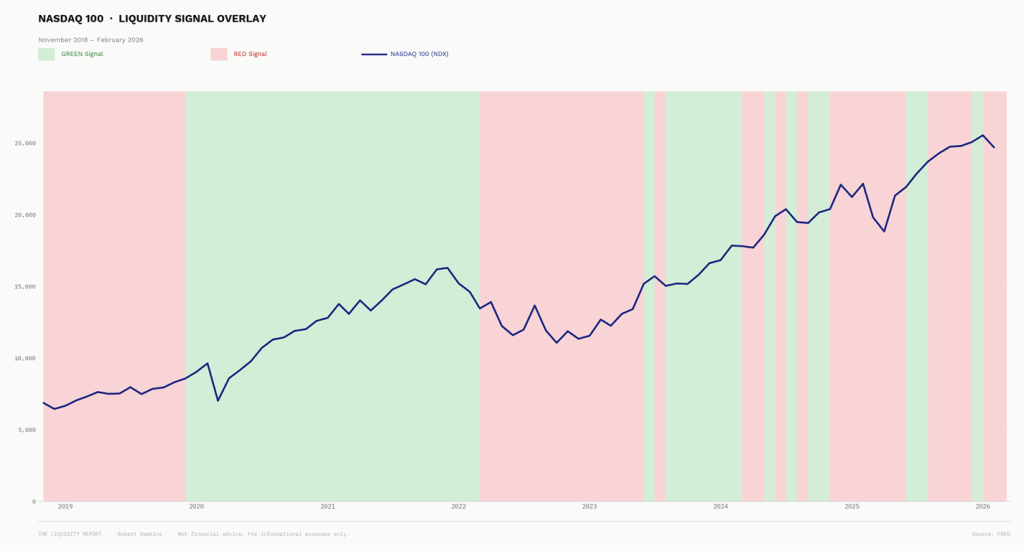
Green periods: liquidity expanding. Red periods: liquidity contracting.
Look at how consistently those conditions align with what markets actually did.
This isn’t a coincidence. And it isn’t a theory. It’s one of the most well-documented relationships in modern macro investing.
The Liquidity Cycle Model
The chart shows the pattern. But behind it sits a detailed breakdown of exactly how this signal has behaved across every phase of those cycles — the GREEN periods, the RED periods, and what happened to a positioned investor during each of them.
That’s what The Liquidity Cycle Model covers.
It’s a ten-minute read. It explains the framework behind the chart in plain language, walks through the historical record cycle by cycle, and shows what systematic regime alignment has looked like across some of the most extreme market environments of recent years.