
For technology investors who want to understand what’s actually driving the market…
The Single Macro Force Behind Every Major Technology Market Phase Since 2018
A short briefing that documents exactly what happened — in real numbers — across bull markets, a global pandemic, and two major technology bear markets
The biggest moves in technology markets don’t line up with earnings seasons.
They don’t line up with product launches, analyst upgrades, or news cycles.
They line up with something most investors never track.
And once you see it, the biggest phases in technology market history start to look a lot less random.
Most investors are watching the wrong thing
When technology stocks surge, the explanations arrive quickly. Strong earnings. AI momentum. Risk appetite returning.
When they fall, the explanations are just as confident. Rates too high. Valuations stretched. Sentiment shifted.
Here’s the thing — those explanations almost always arrive after the move has already happened.
Which means they aren’t explanations at all. They’re stories invented to fit the outcome.
The real driver is something different. Something structural. Something that has been governing the major phases of technology market performance — consistently, repeatedly — for years.
It’s called global liquidity
When the supply of money flowing through the financial system expands, technology markets tend to thrive. Capital becomes abundant. Investors are willing to fund long-term growth. The sector leads.
When liquidity contracts, the opposite happens. Capital becomes scarce. Investors grow cautious. Even strong technology companies struggle when the broader environment turns against them.
This isn’t theory. It’s a structural relationship that has played out across every major market phase since 2018 — through conditions that included a global pandemic, the fastest monetary tightening cycle in four decades, and one of the most powerful AI-driven rallies in market history.
The Liquidity Cycle Model documents exactly what that looked like.
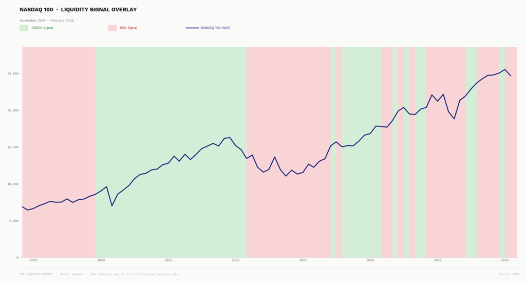
The historical record
$100,000 of NASDAQ exposure. One signal. Applied consistently from November 2018 through to February 2026.
Full exposure when liquidity was expanding. Reduced to 20% when it was contracting.
Nothing else changed. No stock picking. No market timing. No predictions.
The results are documented phase by phase — every GREEN period, every RED period, every transition.
Including 2022, when the NASDAQ fell 32% and the signal had already moved to reduced exposure.
And including a more recent episode in 2024 and into 2025 — when the NASDAQ fell 7.7% and the total drawdown on the position was just 1.4%.
The same principle. Working again. With even cleaner results.
Final value: $253,027. Total return: +153%.
Across bull markets, a global pandemic, two major technology bear markets, and one of the most volatile periods in modern market history.
What you get
The Liquidity Cycle Model is a short briefing — about ten minutes to read — that explains the framework in plain language and walks through the complete historical record, phase by phase.
No economics background required. No jargon. No predictions.
Just a clear explanation of what’s been driving technology markets — and the documented record of what happened when it was applied systematically over seven years.
$9.
No risk
If you don’t find it useful, let me know and I’ll refund every cent. No questions asked.